Sunday, February 03, 2019
kom med mig... / come with me...
my friend christina and i have been planning an exhibition together for over a year. and by planning, i mean we made a pinterest board in january of 2018. we've put it off a couple of times because life and mostly work got in the way and we didn't manage to create anything worth exhibiting, but on saturday, we redeemed ourselves and held an opening - with snacks and drinks and everything! and i have to say that i'm really proud of what we made.
back in october, we had a getaway on the island of samsø, where christina's sister has a lovely summer house. while we were there, i made sewed up this little paper feathery dress that had been rolling around in my head for ages. once i allowed it to come out, it came out very quickly and i had it made in under an hour or so. i had painted abstract atoms on the newspaper and cut out the feathers in advance, so it was just a matter of coming up with a design and sewing it all together. when we were first hanging the works, i didn't think it was going to work as part of the exhibition, but was very happy that we found a way to show it as well.
the centerpiece was this mannequin with a spectacular headpiece/bird mask (more about that below), encircled by long banners of different scenes painted on old book pages and sewn together on the sewing machines in long garlands of 7 pages each. the book was chosen randomly from my collection of old books that i was saving to violate. it was the right size and the pages were quite thick, decent paper and there were illustrations, so i cut it up and painted a whole lot of abstract atom-like shapes on one side using payne's grey ink. those abstracts are my attempt to try to break out of my fear of placing brush to paper and of making mistakes and being a bit more wild. it's surprisingly hard for me to do that. but after painting a 100 or so pages, i felt a bit more free.
christina then got to work painting her speciality - birds and bits of birds - on the other side of the pages - sticking to a limited palette of payne's grey, bordeaux and yellow, with small accents of a more true red and some black. the book turned out to be biblical illustrations and a retelling of the old testament from 1923. though the book was chosen rather haphazardly and without thought for the subject matter, the pages began to speak to us - causing painted wings to seem like they belonged to angels, rather than birds, and provoking christina to paint a few scenes with breasts. i painted quite a lot of birds and feathers as well. and a whole lot of small boats came out here and there. i found myself surprised by what ended up on the page when i gave myself over to the process and let it flow.
we knew we didn't want to hang the works on the walls, but have it be more of an installation. we painted ourselves a payne's grey forest on sheets of plastic that's normally used under insulation in building a house. the way the light comes through it looks pretty amazing and we hung it in two rows so that it felt like you had to step into the forest to enter the world of the exhibition. we did one tree in bordeaux, which was one of the other colors we had in our limited palette. the limited color palette helped our individual styles come together and harmonize, despite the differences in the way we paint and the lines we put down on paper.
i spent hours cutting out paper feathers for this mask and enlisted husband's help in forming the headpiece itself - which is a beak. it was originally a mask in our minds, but ended more as a kind of hat. the creative process sometimes takes you in surprising directions. naturally, when husband got involved, he wanted to use wood (i had been thinking paper or maybe papier mache). he used a big hunk of wood and started off what ended up as an absolutely exquisite piece, by whittling down the log with a chainsaw. i wish i'd filmed that.
he also was the one to place the paper feathers i had cut out, taking ownership of the piece and finishing it absolutely spectacularly. it really was the crowning glory of the exhibition, bringing together our vision, which started with this video by thievery corporation. we loved the uncanny feeling of it - the way it was repulsive, yet attractive and fascinating. we wanted our bird woman to be the same, tho' she ended up not at all repulsive, but strong and assured, eclipsing our birdman, who was painted flatly on one of the sheets of plastic. she was the star of the show and although she is beautiful, she is also rather uncanny.
i found a dress for her in a second-hand shop - it had flowers that matched our payne's grey, with a kind of white slip underneath. once we had the headpiece on, the dress was the wrong pattern and took away from the beautiful headpiece, so we stripped her down to the slip and it was absolutely perfect.
at the opening, people could walk in among the works, looking closely at the details on the pages. people noticed things we hadn't even noticed ourselves. like wings on pages that spoke of angels and breasts on a page that talked about the lord's heaven. we had many wonderful discussions with people - about the creative process, about the biblical pages, about the payne's grey, about sewing on paper. it was such a pleasure to share the work and to see how it was received and to once again be reminded that ideas are always better when they are in dialogue with other people's ideas. our work became richer and deeper, even to us, when we shared it with others.
this little boat was another thing that's been in my head for some time and which just had to come out during this creative process. the paper is some very thin but strong chinese paper that we used to make seaweed prints on the beach during that weekend on samsø back in october. i fashioned the small boat out of fine wire and just glued the paper in place. The boats are light and airy and looked just gorgeous in the window against the blue sky when i took the pictures today.
i'm really proud of this work and this collaboration. we had a few prints done up of some of the best of the small paintings we did on the book pages and there are a few leftover from the opening. i put them in my big cartel shop here, if you're interested in having a look. they're signed and numbered and will only be available in a limited edition of ten of each.
Wednesday, August 30, 2017
payne's grey is my spirit animal (or something)
i love payne's grey tusch and the main thing i like to sketch is naturey stuff. i watered down the ink and painted with a feather i found on the beach. bliss.
Sunday, February 14, 2016
another successful drink & draw weekend
i had a little weekend getaway with a few friends. one of them has moved over to fyn (the island between us here on the "mainland" and the big island where they keep copenhagen) to an idyllic little village and opened a gallery and B&B. so charming! and she's got a beautiful studio, where she showed us how to do the monoprint technique she's been working with of late. we used "china paper" - a thin, but surprisingly strong paper that can take a lot of layers of paint and texture.
so much fun. we each chose a color palette and after a walk, to gather bits and bobs from nature, we settled in to work. we used a variety of techniques - painting with acrylics, using gel pens, printing with feathers and plants, slowly building up texture on our pieces.
i found myself working with mustard yellow, teal, payne's grey (it looks quite black in these photos) and a peachy color that i mixed, plus the odd metallic gold accent. it was interesting how we were each drawn to a specific palette that i'm not sure any of us consciously knew we had in our heads.
some of my pieces worked and some didn't. some worked for awhile and then stopped working. it was an interesting process and one which i thoroughly enjoyed, but never really felt i had control over.
through it all, we laughed and drank some wine and enjoyed some good vegetarian chili, told stories, shared and laughed some more. we had moments of silence, deeply concentrating on our work, and then more laughter and sharing. it was that kind of powerful feminine medicine that you just need once in awhile.
i was surprised by the direction some of my pieces took - these two got rather dark after i became inspired to use a bit of dusty grey pastels on them, giving them a very different look than my other, bright pieces (underneath, the palette is the same). and some of my old favorite helleristning motifs came out from somewhere in my subconscious. it felt right, like moments of flow always do.
here's the end result of one of the others - i think you can tell that she's actually educated as an artist.
this friend did two rounds of the small sheets of chinese paper, with very different color palettes. she felt the second round went much better than the first. but sometimes it does take warming up when you're learning a new technique.
and our hostess, who had been working with the technique for some time, made some beautifully textured, multi-layered pieces. beautiful to see the individual ways our creativity manifested itself, expressing something utterly unique, using similar materials. magical. we definitely need to do this more often.
Sunday, January 02, 2022
2021 :: a second plague year, in pictures
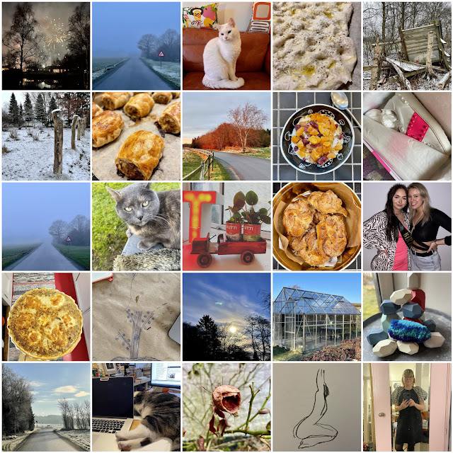
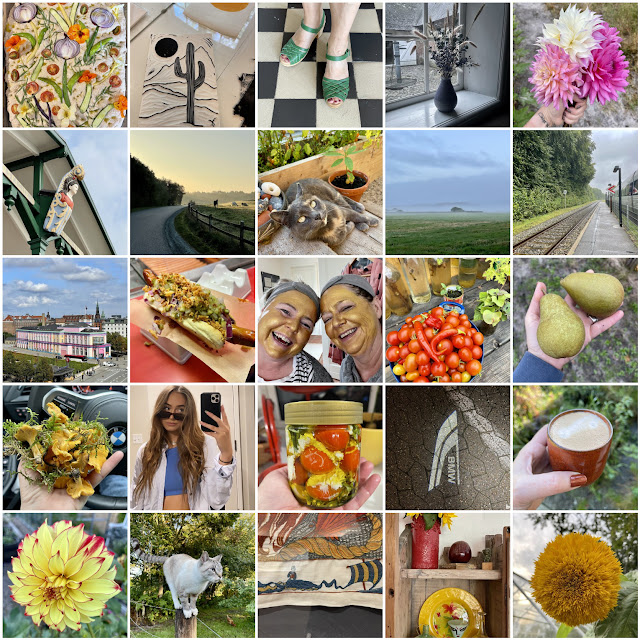
it started off ok. a quiet new year's with friends, some baking - homemade sausage rolls, cardamon buns, quite a lot of working from home. we were able to hold a couple of croquis sundays before everything shut down in earnest. we bought a greenhouse on the blå avis and spent a saturday dismantling it and carting it home. and our child turned 20 halfway across the world! so we gave her valentino sneakers in neon pink. as one does.
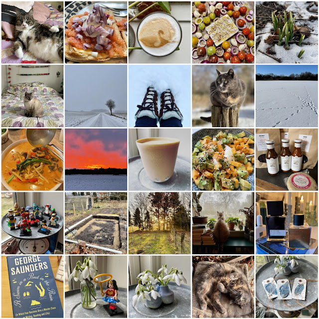
working from home meant my coworkers were mostly lounging around on the bed or staring out the windows. i was jealous of them. we had actual snow and enough cold temperatures so that the lake actually froze and though we oddly didn't skate, we spent a whole weekend down there, enjoying being on the ice, grilling sausages and loving that there was some actual winter. a week later, temperatures were mild, so we dug the foundation for the new greenhouse. i started a 100 days of payne's grey project, but quickly fell behind and abandoned it in a kind of malaise brought on by the monotony of working from home with shitty internet.
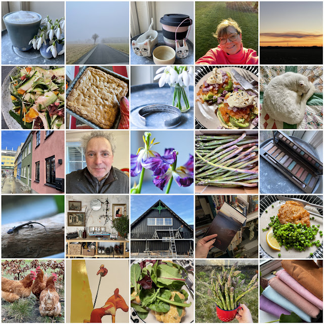
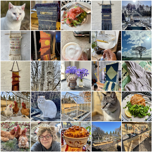
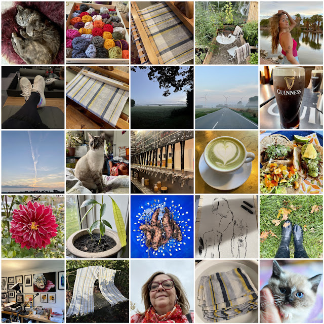
i resolved to grab all the chances i could for creativity, starting with a lovely weekend down in højer with my creative group. it was absolute bliss and i even got a pair of green sandgren sandals in a little shop run by a lovely woman who i believe made up prices for each customer individually. i made an artwork of a focaccia with all kinds of goodness from the garden to take along for sharing and we made quite a lot of linoleum prints while we were there. then, a few days later, i went to fanø for a very enjoyable day with my weaving group. then, our team had a much-needed trip to copenhagen together and went a long ways towards repairing the damage wrought by too many months of working from home and a boss who had gone down with stress. the coffee continued to be much better at home and the garden generously provided flowers for all the vases in the house.
Monday, January 31, 2022
printmaking and the fog of living in a global pandemic
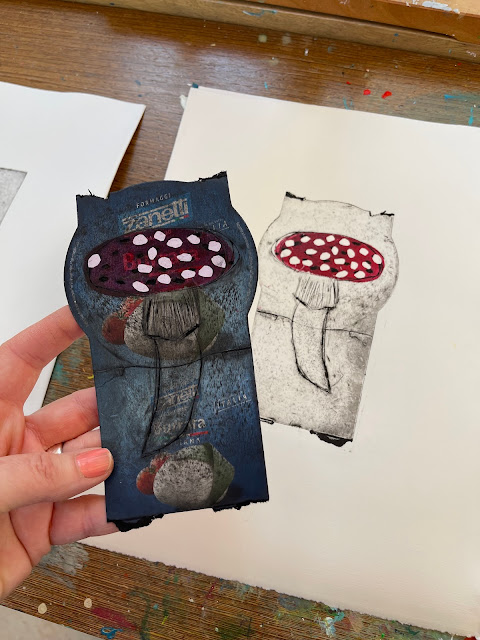
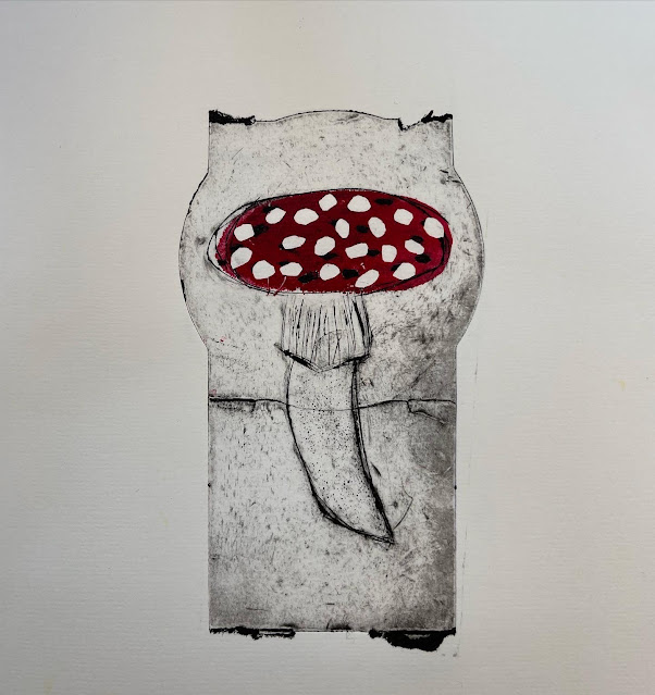
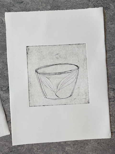
i've been seeing people on instagram that are doing collography using packaging as the base. i took the packaging from my burrata and i really love the result.
Sunday, September 17, 2017
the view from sunday night
i doodled this with a feather and payne's grey ink while watching goldfinger with my family. we're making our way through all of the james bond films, from the very beginning. i'm struck by that sean connery wasn't actually that cute when he was younger and he's kind of a terrible actor. the fight scenes are the worst and there are hilarious low budget moments in the film. it doesn't hold up well and yet it's still somehow iconic. i was happy that i was drawing during it tho', i think it might have been wasted time if i hadn't been.
the venerated TLS published a cover story by a nicholas gibbs, who claimed to have deciphered the voinych manuscript. the atlantic (and others) say, not so much. and this guy claims, on twitter, that nicholas gibbs doesn't even exist, and the whole thing is a pale fire-style stunt. whatever it is, that infernal manuscript continues to fascinate.
they say that postmodernism is dead. but aren't we still living it? what were we thinking, questioning reality and whether anything could be real? what a mess that's gotten us into now, with a post-truth spray-tanned president spewing his daily lies on twitter. could it get any more postmodern than that?
Saturday, February 09, 2013
on drinking and drawing and laughing and talking and nurturing one's soul
i didn't know what i was going to actually draw at drink & draw - i put way more thought into the food i'd make than to the actual drawing part. but when one of the guests, who is a librarian, took out a book of poetry, a library book, no less (tho' it's one the library was getting rid of), to draw in, i knew i had to draw in a book as well. it's one i bought ages ago in some or other flea market - purchased because it had a gorgeous art deco cover (it's in the background of this photo). i hadn't even noticed the name of it, which is talsimanen (the talismen), which seemed extra fitting. i got out the inks (still in love with payne's grey) and got stuck in. it was odd, because initially i felt very restless and unable to settle in and draw, but something about the others drawing diligently away, using pastels and pens and pencils, settled me down and i got into a groove.
there was something magical about the evening. eating good food, drinking some wine and then taking out art supplies opened us all up in a way that the food and wine alone wouldn't have done. we don't know one another that well, but we were soon telling stories of past loves and past husbands and feeling we were in a setting where it was completely safe to share.
it's funny how kim's casual mention on facebook of a drink & draw evening she had attended, morphed into something very meaningful right here in my own home. an evening of laughter and sharing with women who inspire and comfort and challenge (in a good way). it definitely won't be the last time we do this. it's interesting, as i grow older, my need for spending time with women friends seems to on the rise. the evening gave me both that and fulfilled my need to throw ideas out there into the world and see what becomes of them. it became so much more than i had imagined. and it was precisely what my soul needed.
Monday, August 26, 2013
finishing my torso (for now)
we're going to show our torsos this thursday with a big opening splash! so i've been frantically working on finishing mine. it's been sitting there on the sideboard, covered in words, painted blue, but unfinished. i know i want to somehow incorporate some feathers, but i don't know yet how - perhaps this little feather bouquet i found on the beach contains an answer to that.
otherwise, i've been sketching and painting some small drawings of places i love and places which have been influential in my life to decorate the torso. this is the church of sv. jovan kaneo (john the baptist, if i remember correctly) at lake ohrid. influential since i met husband in macedonia, tho' not in ohrid.
st. basil's to signify my russian soul. i sketched or printed old sketches onto some pages from an old encyclopedia - that way the pictures still incorporate words, as words are important to my conception of my torso (and thus myself).
i couldn't resist using the colorful houses of nyhavn in copenhagen to represent denmark, which has, you may imagine, become an enormous influence upon me, having lived here for 15 years now. i loved those colorful houses along the canal when i first visited and seeing them still makes me smile.
and chicago, a sort of composite of places and buildings and that chicago pizza. it's the place from which i jumped off to my life in europe, so it had to be there.
and i couldn't resist a few helleristninger (nordic petroglyphs). they just speak to my soul. i drew them with that fabulous payne's grey ink.
i love this circle of life helleristning. it's long been a favorite. and symbolizes a feeling of community that spans the world (and which centers on this blog in many ways). it is essential to include on my torso.
these were some new helleristning that i came across that i'd never seen before. i love how the one figure appears to be floating away on a balloon. that felt symbolic and important as well. and in general i love that circle with the cross inside - it's the nordic sun symbol. light is so important in this part of the world, that it had to be included.
it is once again evident to me that i am a person in need of a deadline. i'd been procrastinating working on this and tho' i've thought about it pretty much endlessly, nothing was happening on it. but now, when the exhibition looms, ideas are coming together. i came across a package of little bitty people that i found in an antique store in the US last summer and i thought that since i've not used any photos of husband and sabin, that i'd use some little bitty figures to signify them. i included sabin's lost twin as well, because she's also part of who i am.
funny how once you start working, you get in a state of flow and ideas come and things just begin to happen. a garland on which i've written a bucket list to decorate the hanger. in that flow, i hit upon a way to incorporate a few feathers, which i seem to collect wherever i go.
i don't think i will be able to declare my torso officially finished on thursday when it goes to the exhibition, but it will be finished enough to show. i suspect that i will continue adding to it and it will change and grow evolve. just like me.